
More than two months ago, I asked Eriko to help me get a new meishi, and she came through with a whole bunch of cool designs. So cool in fact, that I really couldn’t decide on a single one.
So I went with two designs, which I will each use for separate purposes. I might even add a third one, depending on how these two come out.
I had been slacking on getting them printed, but finally figured I really needed to get moving (in Japan, even more so than in other countries, exchanging name cards is a mandatory part of any conversation that doesn’t involve ordering a big mac with fries).
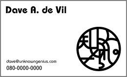
This is the semi-final design (still considering other font options) and I shall be sending it off to the printer tomorrow. Any suggestions?
the second one is better
Second one is better, but change the font a bit, it looks a little too plain to go with the nice graphic design.
Good luck in Japan!
I too prefer the second one. I also think the font goes quite nicely with it. I definitely don’t think you should use a wild font (to match the graphic). This meishi idea is actually pretty cool. I think the Japanese, once again, are onto something here.
I also prefer the one on the right, and think the font looks good.
My meishi are my company’s standard design and are quite dull (especially with the dreadful Arial font). Heh, at least they don’t say “Staff” anymore.
Eriko should give the FreeBSD logo contest a try:
Here is the Japanese translation of the original announcement.